
College
Music
Pineapple
Commons
-Other Graphs
About
|
College Music Pineapple Commons -Other Graphs About |
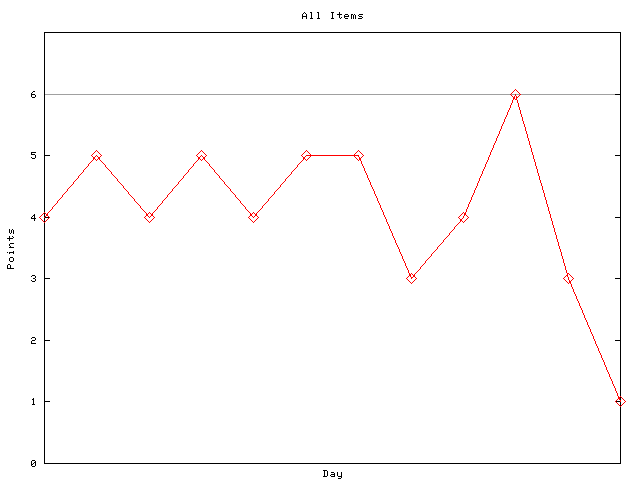
To give a thorough explanation of this project, Commons is a three-course meal served each weekday in the Dining Hall on campus. It has been around for centuries, and was originally attended by almost all of the College population where they might meet and discuss ideas. All Fellows and Scholars can get Commons for free while everyone else can pay for a ticket. The menu can be found here. What many people don't know is that unfortunately, the menu is often not very consistent. When they promise you beef, don't be surprised if they hand you a plate of salmon. A fun idea that was once suggested was to plot this and see how the graph looked. To explain how I've made the graphs, every item gets one point if the listed item is correct. Else it gets zero. I then add up the points and this gives me a coordinate in the form (Day,Points). The graph shown is all the points I have taken down. The grey line is the maximum number of points. If you have a suggestion for a better system, let me know. During my exams, I made a program such that this graph will automatically update itself. You can look at some other graphs that have been generated here. |